Color Wheel

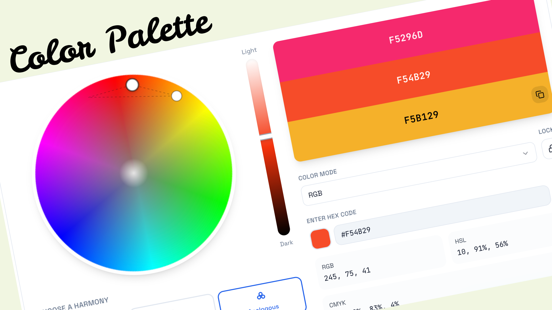
Online Color Palette Generator & Harmony Tool

Create perfect color palettes with our interactive color wheel. Explore complementary, analogous, triadic, and other color harmonies to elevate your designs.

Light
Dark

Choose a Harmony

F5296D
F54B29
F5B129
RGB245, 75, 41
HSL10, 91%, 56%
CMYK0%, 69%, 83%, 4%
color wheel

Color Harmonies

Explore different color combinations based on color theory

#F5296D
#F54B29
#F5B129

Color Variations

Shades, tints, and tones of your selected color

Shades are created by adding black to the base color, making it progressively darker.

DF4425
C83D22
B2371E
9C301A
862916
6F2213
591B0F
43140B
2D0E07
160704

Color Wheel Features

Interactive Color Wheel

Click and drag on the wheel to select any color. Adjust saturation by moving towards the center.

Multiple Color Modes

Switch between RGB and RYB (artistic) color modes for different color relationships.

Color Harmonies

Generate complementary, analogous, triadic, tetradic, and split-complementary palettes.

Shades & Tints

Explore 10 shades, tints, and tones of any color for comprehensive palette options.

Easy Export

Export your color palette as CSS variables or JSON for seamless integration.

Real-time Updates

See all color values update instantly as you explore the color wheel.

Frequently Asked Questions

Understanding the Color Wheel: A Complete Guide to Color Theory

The color wheel stands as one of the most fundamental tools in the history of visual design and artistic expression. Dating back to Sir Isaac Newton's groundbreaking experiments with light in 1666, this circular diagram has evolved from a simple scientific observation into an indispensable resource for artists, designers, photographers, and creative professionals worldwide. Newton's original wheel demonstrated how white light could be split into its component colors through a prism, arranged in a continuous spectrum that naturally loops back upon itself.

Today's modern color wheel builds upon centuries of color theory development, incorporating the work of Johann Wolfgang von Goethe, who explored the psychological effects of colors, and Albert Munsell, who developed a practical system for color notation still used in design and manufacturing. Whether you're selecting paint colors for a living room, choosing a brand palette for a startup, or creating digital illustrations, understanding the color wheel provides a systematic approach to achieving visual harmony.

Key Concepts

  • Hue — The pure form of a color, unaffected by lightness or saturation
  • Saturation — The intensity or purity of a color
  • Lightness — How light or dark a color appears
  • Value — The relative brightness of a color
Primary, Secondary, and Tertiary Colors

Primary Colors

Red, yellow, and blue form the foundation of traditional color theory. These colors cannot be created by mixing other colors together and serve as the building blocks for all other hues. In digital design, the RGB model uses red, green, and blue as primaries.

Secondary Colors

Orange, green, and purple are created by mixing two primary colors in equal parts. Orange emerges from red and yellow, green from yellow and blue, and purple from blue and red. These colors sit between their parent primaries on the wheel.

Tertiary Colors

Vermilion, amber, chartreuse, teal, violet, and magenta are created by mixing a primary with an adjacent secondary. These six colors complete the twelve-section color wheel, offering nuanced options between the bolder primary and secondary hues.

Mastering Color Harmonies

Color harmonies represent the scientific and artistic principles that govern which colors work well together. These relationships, derived from the geometric positions of colors on the wheel, have been validated by centuries of artistic practice and modern psychological research. Understanding these harmonies transforms color selection from guesswork into a systematic process that yields consistently pleasing results.

Complementary Colors

Sitting directly opposite each other on the color wheel, complementary colors create maximum contrast and visual tension. Red and cyan, blue and orange, yellow and purple—these pairs vibrate with energy when placed side by side. This harmony is ideal for creating focal points and drawing attention to specific elements in your design.

The science behind complementary colors relates to how our eyes perceive light. After staring at one color, our eyes naturally seek its complement as a form of visual relief. This phenomenon, known as successive contrast, explains why complementary schemes feel so balanced and complete.

Analogous Colors

Analogous color schemes use three colors that sit adjacent to each other on the color wheel. This creates a harmonious, unified appearance that's easy on the eyes. Nature frequently displays analogous schemes—think of autumn leaves transitioning from green to yellow to orange, or a sunset blending orange, pink, and purple.

When creating analogous palettes, designate one color as dominant, use the second for support, and reserve the third for accents. This 60-30-10 approach prevents the scheme from feeling monotonous while maintaining its inherent cohesion.

Triadic Colors

Triadic schemes employ three colors equally spaced around the wheel, forming an equilateral triangle. The primary colors (red, yellow, blue) represent the most basic triadic combination. These palettes offer strong visual contrast while maintaining color balance.

Triadic schemes work exceptionally well for vibrant, youthful brands and playful designs. To prevent visual chaos, let one color dominate and use the others sparingly as accents.

Split-Complementary Colors

A variation on complementary colors, split-complementary schemes use a base color plus the two colors adjacent to its complement. This creates a gentler contrast than pure complementary pairs while still providing visual interest.

This harmony is excellent for beginners because it's almost foolproof. The built-in variety prevents the design from feeling flat, while the softer contrast makes mistakes less obvious.

The Psychology of Color

Colors communicate on a subconscious level, triggering emotional responses before our conscious mind has time to process what we're seeing. This psychological impact makes color choice one of the most powerful tools in a designer's arsenal. Research consistently shows that color can influence purchasing decisions, brand perception, and even physiological responses like heart rate and appetite.

Warm colors—reds, oranges, and yellows—advance toward the viewer and create feelings of energy, excitement, and warmth. Red, the most stimulating color, has been shown to increase heart rate and respiration. It's why many restaurants use red in their branding to stimulate appetite and create a sense of urgency. Orange combines the energy of red with the cheerfulness of yellow, making it ideal for calls to action and friendly, approachable brands.

Cool colors—blues, greens, and purples—recede from the viewer and evoke calmness, trust, and professionalism. Blue, the world's most popular color, is favored by financial institutions and technology companies for its associations with stability and reliability. Green, positioned at the center of the visible spectrum, is the easiest color for the eye to process, making it ideal for environmental brands and applications requiring extended viewing time.

Red

Energy, Passion, Urgency

Blue

Trust, Calm, Professional

Green

Growth, Nature, Balance

Yellow

Optimism, Clarity, Warmth

Purple

Luxury, Creativity, Mystery

Orange

Friendly, Confident, Fun

Pink

Playful, Romantic, Feminine

Black

Elegant, Power, Sophistication

Practical Applications of Color Theory

Web Design

In web design, color serves functional as well as aesthetic purposes. Primary colors guide users through the interface, with accent colors highlighting interactive elements. Maintaining consistent color usage across buttons, links, and navigation creates intuitive user experiences. The 60-30-10 rule translates naturally to web design: 60% background color, 30% secondary color for content areas, and 10% accent for calls to action.

Accessibility must inform every color decision. Ensure text maintains a minimum contrast ratio of 4.5:1 against its background. Avoid relying solely on color to convey information—always include secondary indicators like icons or text labels. Consider how your palette appears to users with various forms of color blindness, which affects approximately 8% of men and 0.5% of women.

Brand Identity

A brand's color palette often becomes its most recognizable asset. Consider how instantly we recognize the red of Coca-Cola, the blue of Facebook, or the multicolored Google logo. When developing brand colors, research your industry's conventions—financial services gravitate toward blue for trust, while environmental organizations favor green for obvious reasons.

Differentiation matters equally. If your competitors all use blue, consider how a complementary color might help you stand out. Document your brand colors precisely, including HEX codes for digital use, RGB values for screen displays, CMYK for print production, and Pantone references for manufacturing. This ensures consistency across all touchpoints.

Understanding Digital Color Systems

Digital color reproduction relies on several interconnected systems, each optimized for specific applications. The HEX color system, ubiquitous in web development, represents colors as six-digit hexadecimal codes. Each pair of digits corresponds to the red, green, and blue channels, with values ranging from 00 (none) to FF (maximum). This compact notation makes HEX ideal for CSS and HTML.

RGB (Red, Green, Blue) explicitly states each color channel as a value from 0 to 255. This additive model mirrors how computer monitors produce colors by combining different intensities of red, green, and blue light. Pure white (255, 255, 255) results from maximum intensity on all channels, while black (0, 0, 0) indicates the absence of light.

HSL (Hue, Saturation, Lightness) offers a more intuitive approach to color manipulation. Hue represents the color's position on the color wheel as a degree from 0 to 360. Saturation, expressed as a percentage, indicates the color's intensity—0% produces gray, while 100% yields the purest form of the hue. Lightness, also a percentage, ranges from 0% (black) through 50% (pure color) to 100% (white).

CMYK (Cyan, Magenta, Yellow, Key/Black) serves print production, where colors are created by subtracting light through layered inks. Unlike RGB's additive model, combining all CMYK colors produces something approaching black (though pure black ink is added separately for depth and economy). Understanding the RGB-to-CMYK conversion process is essential for designers creating work that will appear in both digital and print formats.

Advanced Color Techniques

Color Temperature

Beyond the warm/cool division, subtle temperature shifts can dramatically affect a color's character. A slightly warmer blue feels more approachable, while a cooler blue conveys greater professionalism. Photographers and filmmakers use color temperature to establish mood and time of day, with warm oranges suggesting sunset and cool blues indicating moonlight.

Simultaneous Contrast

Colors appear differently depending on their surroundings. A gray square looks warmer against a blue background and cooler against an orange one. This optical phenomenon, identified by Michel Eugène Chevreul in the 19th century, remains crucial for designers. Always evaluate colors in their intended context rather than in isolation.

Color Proportion

The amount of each color in a composition matters as much as the colors themselves. Goethe's color theory included proportional relationships—yellow requires less area than violet to achieve visual balance. Modern designers apply this through the 60-30-10 rule, but understanding the underlying principle allows for creative departures.

Start Creating with Confidence

The color wheel transforms the subjective experience of color into an objective framework for making design decisions. Whether you're selecting a single accent color or developing a comprehensive brand palette, the principles of color theory provide reliable guidance. Start with the harmonies that resonate with your project's goals, experiment with shades and tints to add depth, and always test your colors in their final context.

Remember that these principles are guidelines, not rules. The greatest designers understand color theory deeply enough to know when to follow it and when to break it for effect. As you develop your color intuition through practice, you'll find that the wheel becomes less of a crutch and more of a springboard for creative exploration.

Explore More Tools

Discover our collection of free design and development utilities